Crafting authentic branding for Harriet Sloan: reflecting the positive and inspirational essence of her personality.
My visual direction
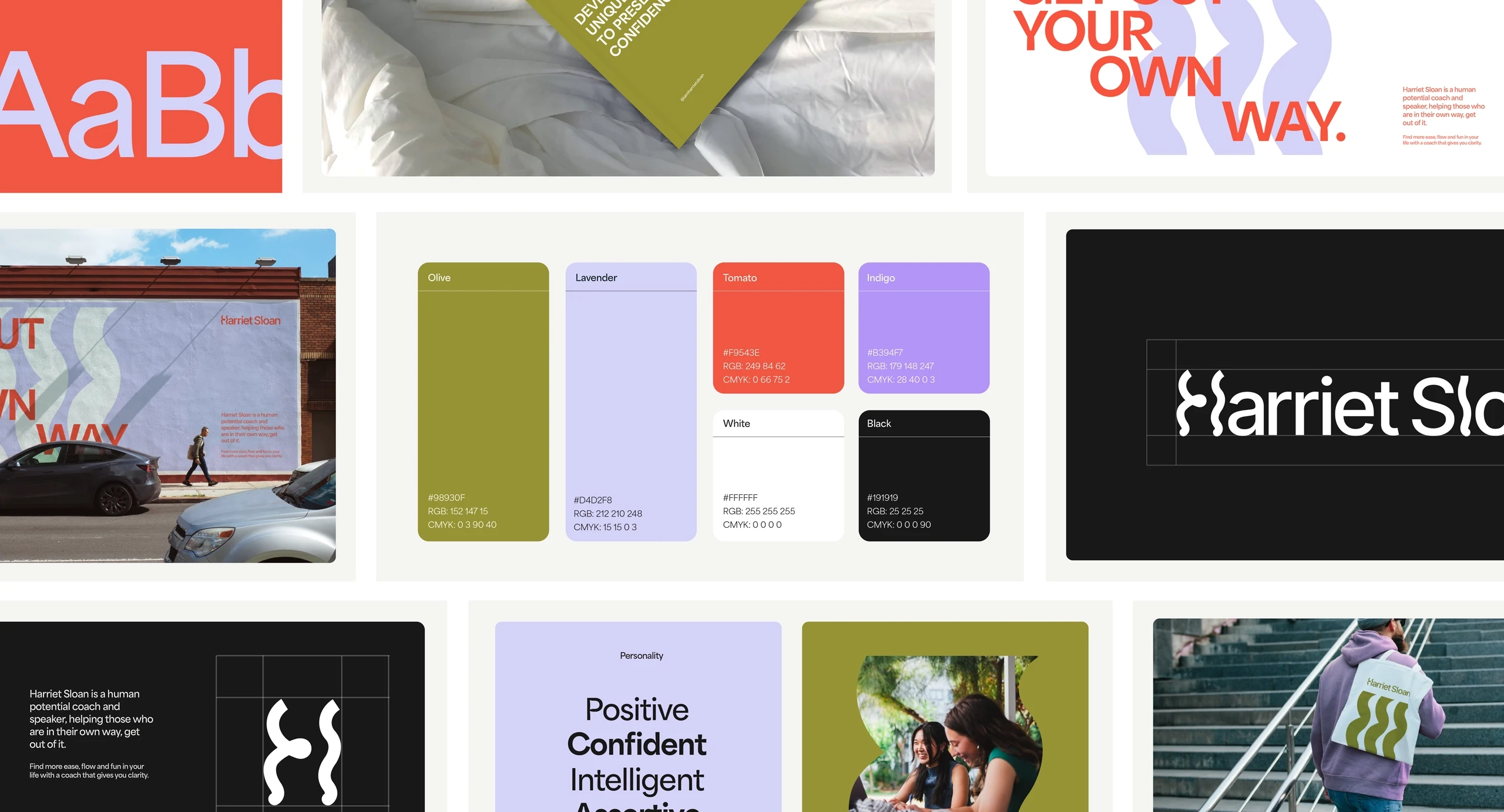
My aim was to infuse playfulness and fluidity within a foundation of calm assurance.
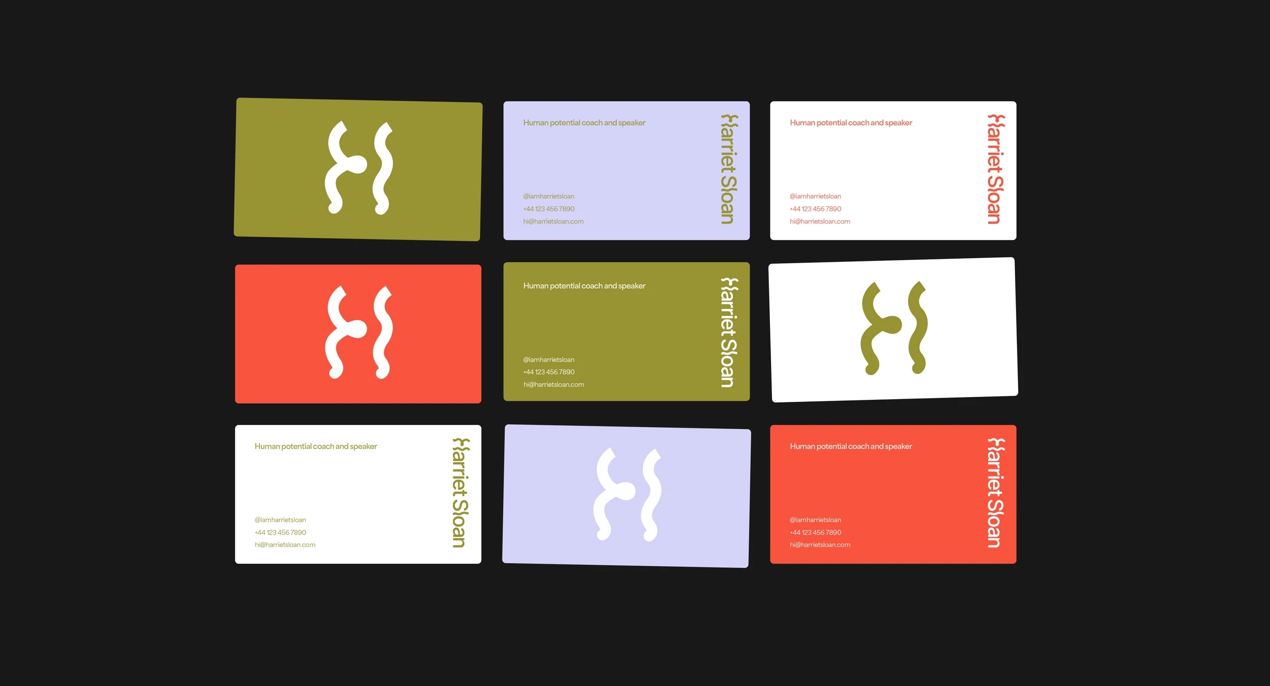
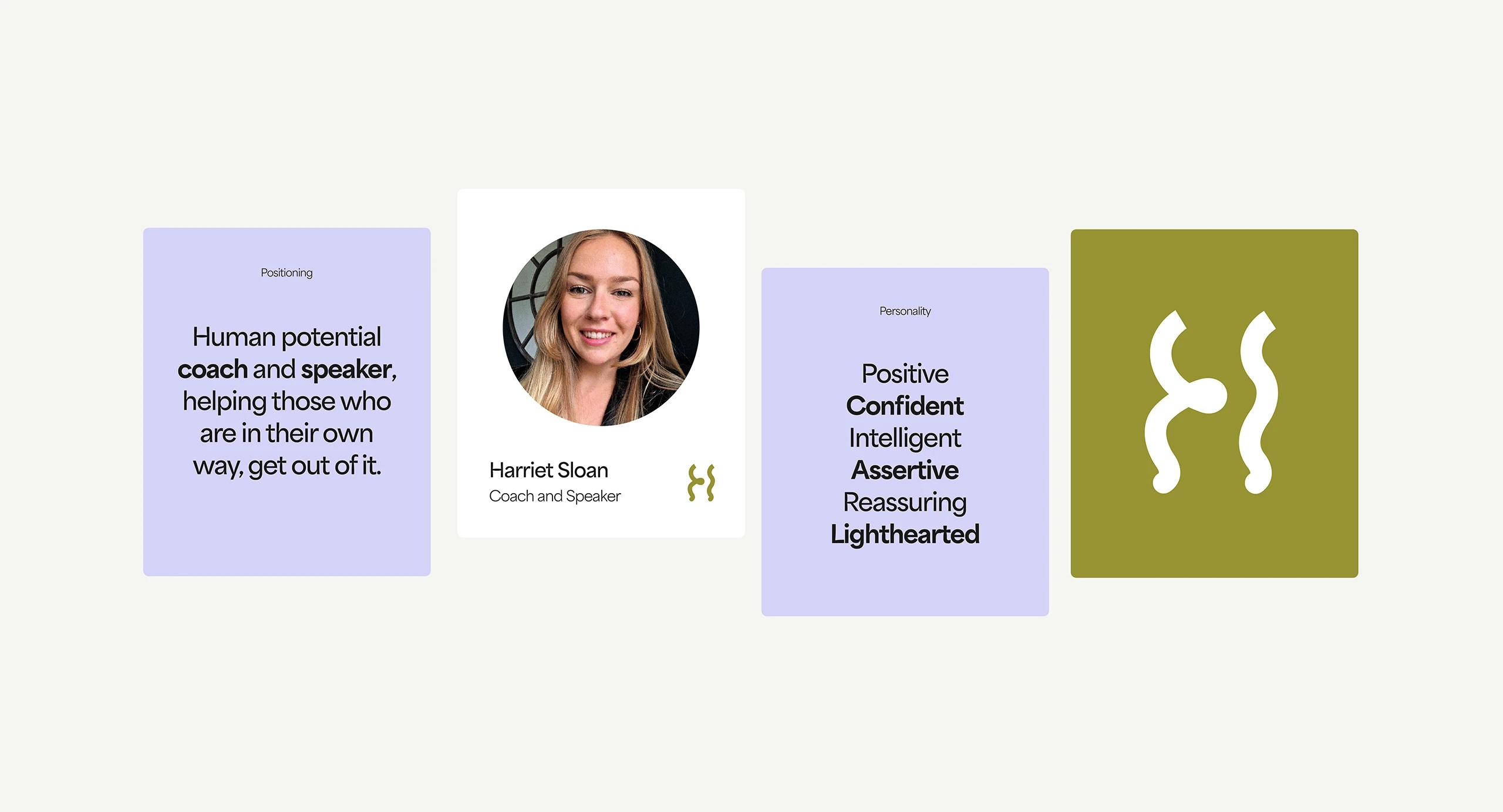
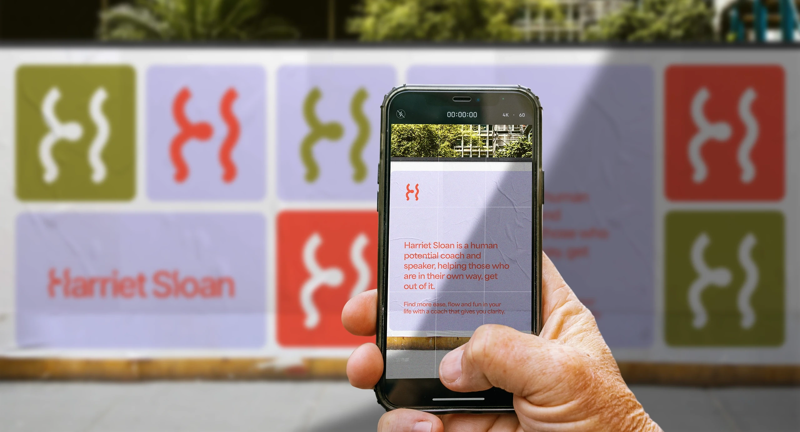
The logo wordmark showcases wavy letters, imparting a sense of creativity and joy. Notably, the 'H' is crafted from two mirrored, undulating lines, serving as the brand symbol.
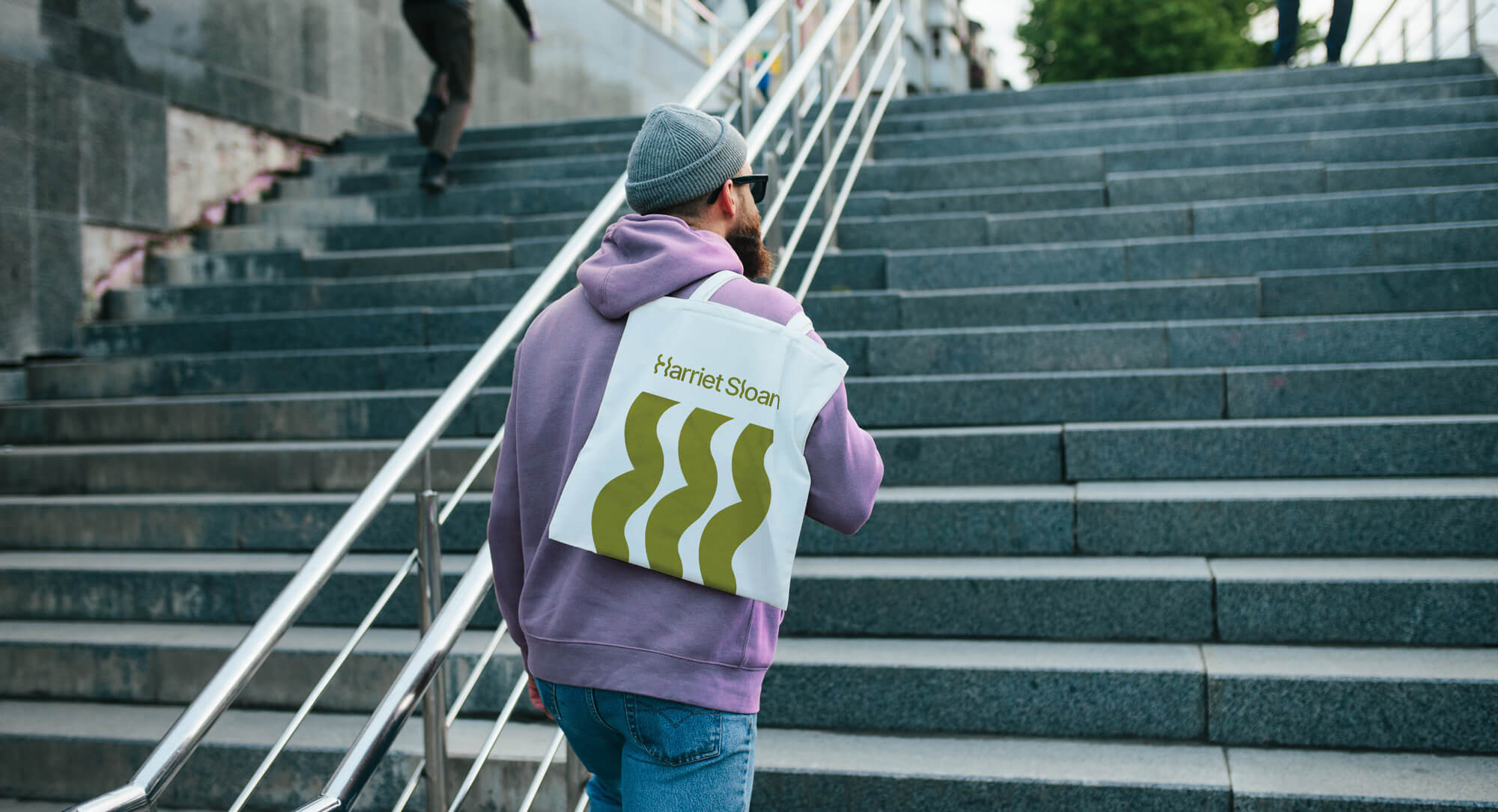
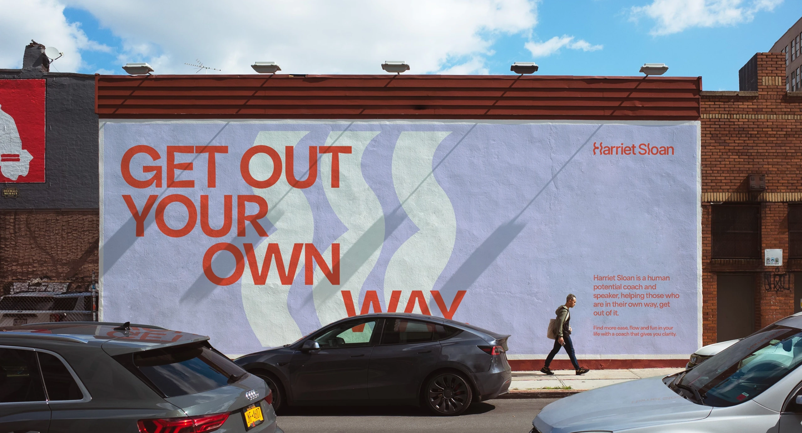
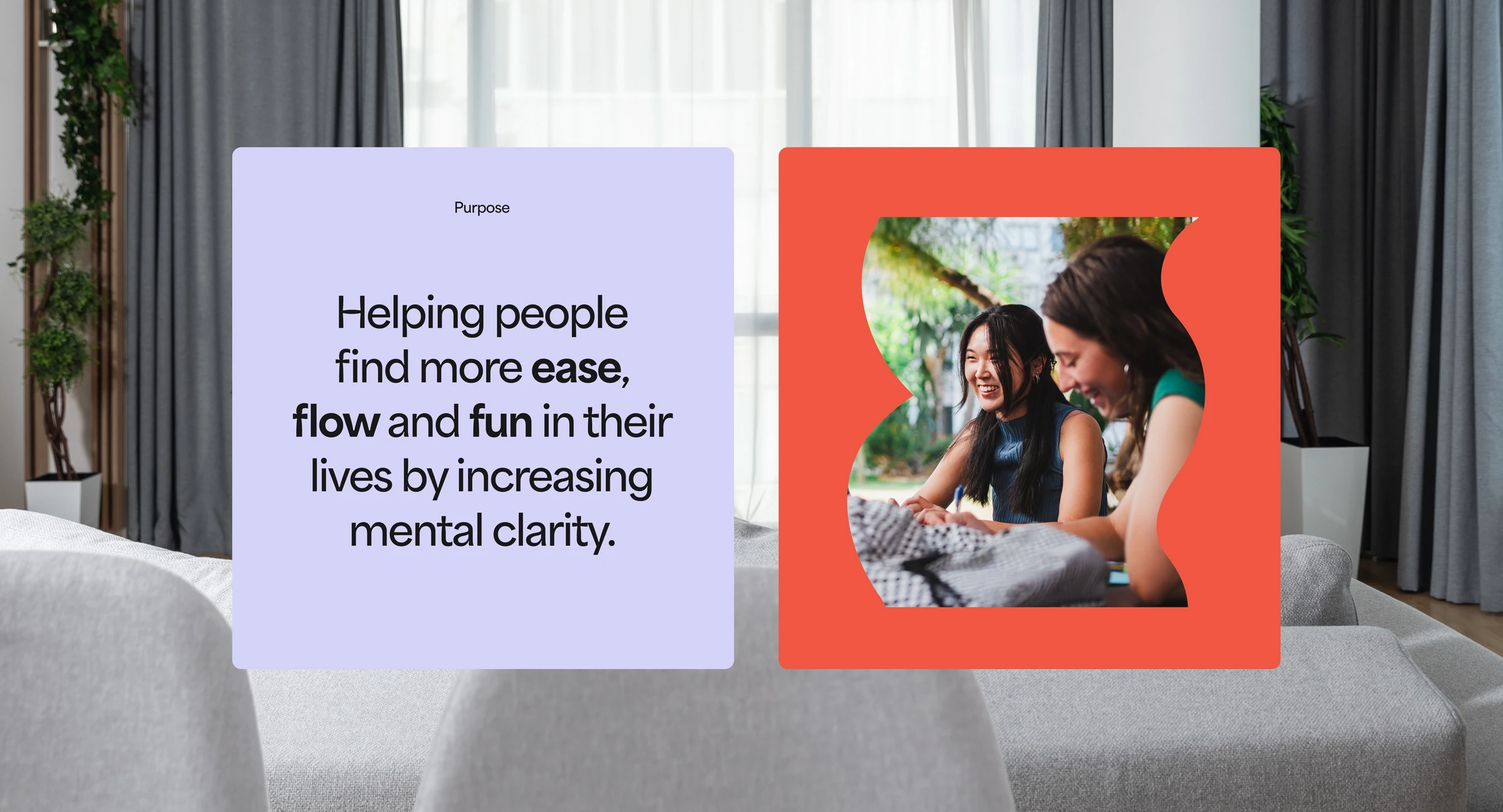
The result is a distinctive brand identity featuring flowing lines and shapes, minimalist typography, dynamic colors, and adaptable layouts.
My process
Strategy development
We began with a kickoff call and questionnaire to understand Harriet's vision, goals, and preferences. I developed a detailed brand strategy covering positioning, audience analysis, journey mapping, competitor review, and defined the brand’s tone as positive, intelligent, confident, assertive, yet approachable.
Visual direction
I prepared mood boards with various design directions, focusing on colors, fonts, and styles that matched Harriet’s preferences. We refined what elements best with fit her vision and my recommendations.
Design conceptualization
I developed two design concepts, each with a logo, symbol, color palette, typography, icons, patterns, and practical examples. Harriet chose her favorite.
Feedback and delivery
I incorporated feedback of improving vibrancy and balance, leading to final approval. After refining and stress-testing the visual system, I prepared assets for immediate use and packaged it all up with a handy brand guide.
"I'm completely new to branding and marketing, but the discovery process Hettie took me through was so thorough, it's not only resulted in a brand I absolutely love but also helped me get more clarity on my business and where I want to take it. Hettie is warm, professional and completely pragmatic. Working with her was seamless and I would recommend her to anyone wanting to create a brand."
Harriet Sloan, Founder
